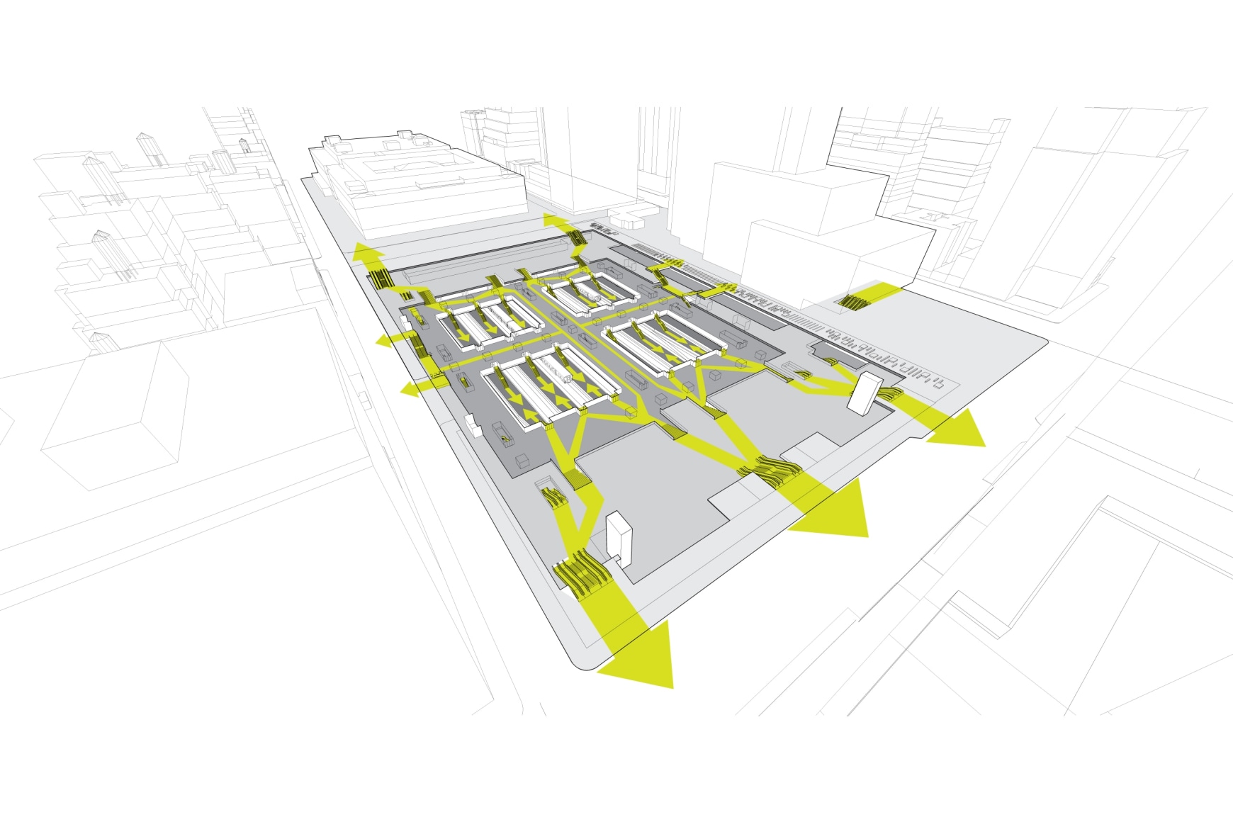
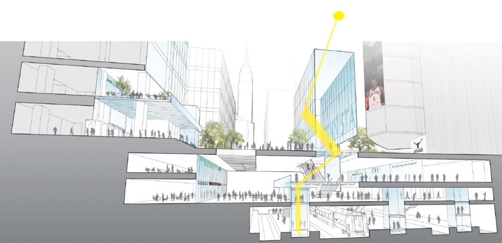
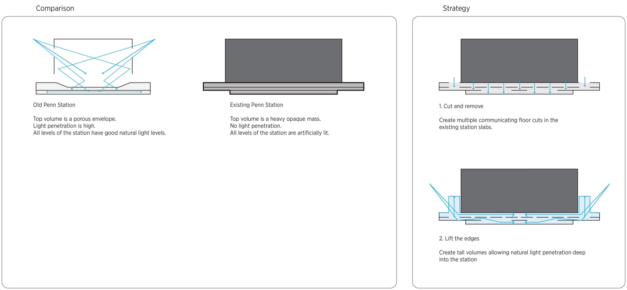
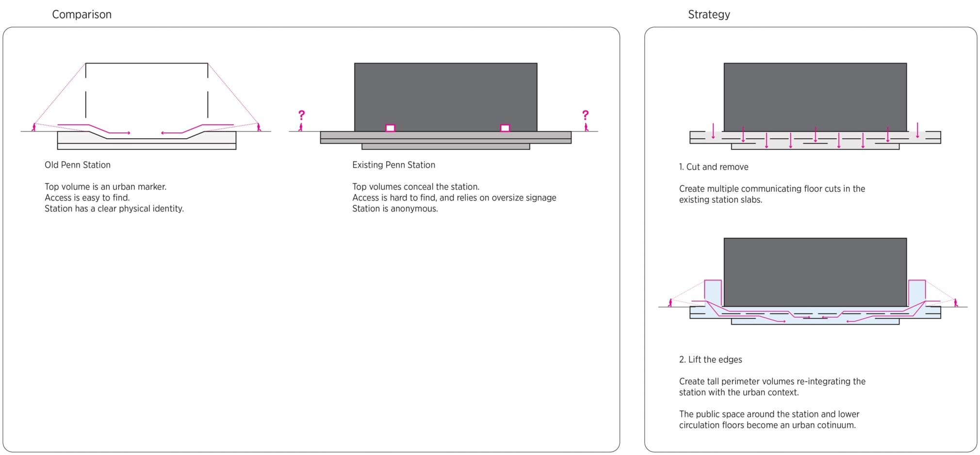
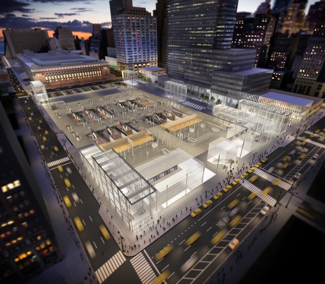
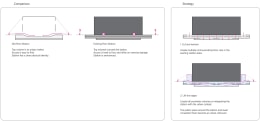
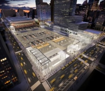
Inspired by the McKim, Mead & White’s Beaux Arts station that used to occupy the site, this urban renewal project transforms the current subterranean station and preserves the stadium above by applying a synthesis of the original building’s extraordinary manipulation of light.
PENN STATION VISIONING
NEW YORK CITY, USA
2011
BackImages
Description
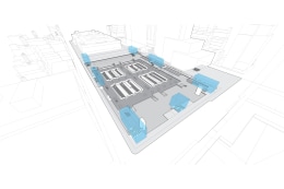
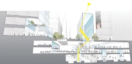
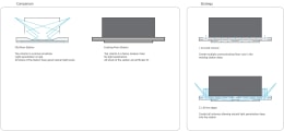
JCDA was hired by AECOM and the railroad partners (NJ Transit, LI Railroad and Amtrak) to create a design language and an exterior identity for a Penn Station master plan. JCDA envisioned glass pavilions aligned to the street grid and articulated to redirect views and light along diagonal view corridors strategically carved out of the subterranean station’s floor plan. Four large corner pavilions and three mid-block pavilions largely of glass, maximize views directly into and out of the station at the immediate street level. Above this clear glass expression, a series of perforated screens are hung, helping to modulate and direct light down into the station, while limiting the glare and heat gain within the pavilion volume. The screens are conceived as suspended planes of metal that re-establish the street wall along 31st and 33rd street, including future retail spaces that further enliven and activate the program of the new district. At the tops of the pavilions, a series of light planes direct light down into the station thresholds. This light punctuates and announces connections to the city at the ends of a series of widened corridors. The new corridors, some of which already exist in compromised states in the current station, re-establish the street grid at both levels of the new station, providing intuitive way finding.
Along 7th Avenue, several new urban rooms are envisioned on either side of a new entry pavilion at 32nd Street. These spaces are unified by a large series of light re-directing panels at the roof level, similar to the panels at the tops of the corner pavilions, and large openings between the pavilion and the urban rooms allow for direct connections to Madison Square Garden. The vertical enclosure of these spaces is a minimal clear glass wall, allowing people moving along the sidewalk outside the station to look directly in and see train departure and arrival information. From the interior of these urban rooms (which house the ticketing program for the commuter rail), there is a direct visual connection to the street and the buildings along 7th avenue.
A critical part of the street level identity is bringing the unified language to the street, clearly identifying and establishing a distinct civic place defined by the busiest rail hub in the United States. Central to this is the need to consolidate loading operations to the south of the site, along 31st street, so pedestrians and vehicular movements are separated. This enables partial or full street closure of 33rd street, which can be re-programmed with retail along the edges and re-purposed with seating and raised planters that also act as skylights, re-directing light into the busy 33rd street corridor level of the station.
